Mobile websites are not a new phenomenon – they’ve become a commonplace in e-retail and standing out with beautiful UI/UX is more important than ever. Their traffic increases steadily – according to Statista, the share of mobile phone traffic in 2018 was 52.2% of the whole website traffic worldwide. This is an obvious proof that e-commerce mobile design shouldn’t be overlooked.
The same goes for E-commerce websites. It’s much more likely that nowadays customers will shop and interact with websites from their smartphones or tablets – a trend, which began due to our lives becoming fast-paced, busier and more complex. Consumers expect to get products and services instantly and “on-the-go”, and if your shop is not prepared for such demands, the natural consequence will be losing clients.
How do mobile websites attract new users?
First and foremost, mobile websites, regardless of their design, have impressive page speed and are able to load content faster than PCs. Secondly, it is all literally in the hands of users – people have actual, quick and constant access to the products and services they desire. Consumers can be connected to the world of digital information all the time now as smartphones and other mobile devices have become their primary means of online access. Therefore, businesses should focus more on building user-friendly and responsive mobile versions of their web applications. They should aim at creating flawless UX, which lead to speeding the buyer’s journey.
To help you get closer to this goal, we share the 7 things you can do to improve the UX of your mobile websites:
1. Choose your platform
Different platforms have different characteristics and UX design guidelines, which must be followed when building a separate mobile website.
In the first place, you should determine what your business needs – mobile application or mobile website. The key advantage of the mobile app is the fact that you can easily and quickly send notifications. Nevertheless, the development of a native app involves substantial expense for small businesses, which could make it a burden. Secondly, the creation of a mobile website is a simpler option, which solves your problem of choosing the right platform:
- This way you ensure that all online users have access to your store, no matter what platform you use.
- The cost for development is small as you don’t have to construct two independent web and mobile apps but gradually advance your version to fit the different browsers. The mobile-first approach, where you start designing from the mobile end and then expand, has gained massive attention for giving better results.
- The central elements of the e-commerce mobile design are essentially the same as those of a mobile app. This guarantees similar user experience regardless of the type of smartphone the customer owns.
2. Consider supporting Gestures & using Microinteractions
The primary way we interact with our mobile apps, games or tools is through gestures – the secret to making our mobile experience great. If intuitive enough, their use can result in clear and beautiful interfaces. Examples of such gestures include: pinch to zoom, double tap, slide to reveal, etc. Pinch to zoom is extremely important in cases when users have to review a product in detail. Despite the high-resolution of smartphone displays, the size of the device is supposed to be portable and compact.
If you are already supporting gestures, the next step for you would be to introduce microinteractions. What are they? A hot UX trend, microinteractions are all small, subtle product moments that engage and excite the user. They encourage people to interact with the website, provide feedback, improve navigation and make user experience enjoyable.
In e-commerce mobile design, a few of the instances in which microinteractions can be encountered are when: liking and rating a product, clicking the checkboxes on a product page, picking a size/color, swiping to refresh and choosing a category from a dropdown. If you’re trying to invite the user to like a certain product by double-tapping, for instance, a short animation of a red pulsing heart could appear. This stimulates customers’ positive emotions and can motivate them to use the “Favourites” section.
3. Define the mobile navigation workflow
When designing your mobile website, you might be tempted to find an easy and minimal solution and put your navigation in one place – in the hamburger menu:
Although it’s still a popular option on most apps around, it can actually create issues for you and make your user navigation more sluggish and complicated. First of all, the main problem with the hamburger menu is that the navigation button at the top of the screen might be hard to reach. As the screen sizes are getting larger and larger, leaving the central navigation only in hamburger won’t enable your users to navigate efficiently. Secondly, in the case of E-commerce websites, having a hamburger button might add too much complexity. E-commerce sites have a further level of interaction – navigation items, such as shopping cart, product search, wish-list, etc. They each have a page dedicated to it, which calls for another type of menu in order to keep the UI neat.
The major trend for 2019 in mobile navigation design is for the menu to be in a tab bar at the bottom of the screen. This allows for direct and easy access as it solves a few issues:
- You can make use of a unified and central navigation, which always remains in sight. This enables customers to discover all core elements of the website and shows them their location at a glance, regardless of the inside page they are viewing.
- The limitations in screen width – you need to decide on the most crucial navigation options you want to include. This, in turn, lets tabbed navigation achieve a clear and organized UI, where the relevant features are on display and users won’t get disoriented.
4. Focus on the Search
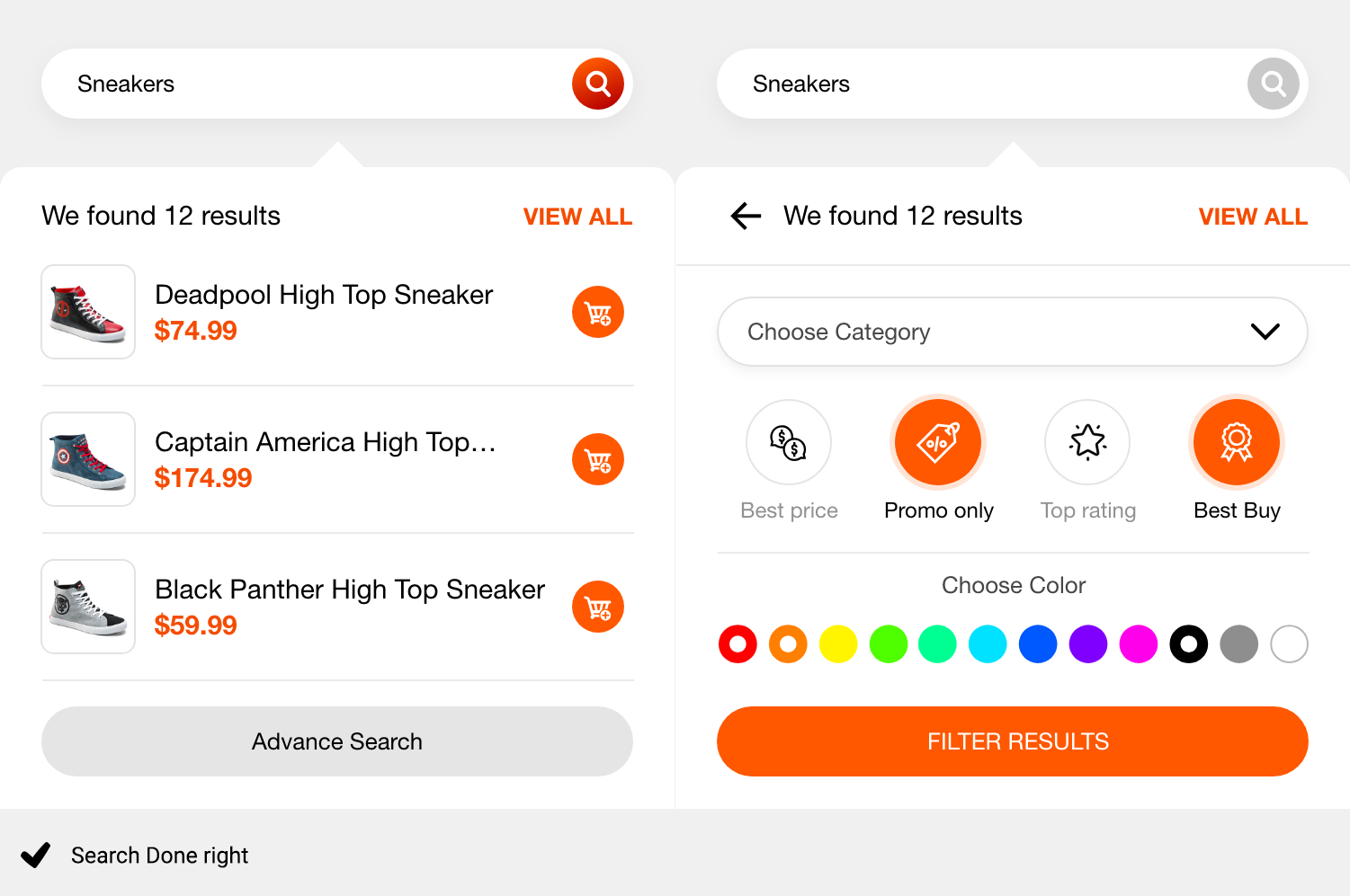
Find the time to build a well-designed search. As one of the most important features for mobile shoppers, the search should be constantly visible no matter which page you are browsing. However, it’s probably unwise to keep the search form visible late in the shopping journey, especially during the checkout process, as this could damage user experience.
What is more, the search shouldn’t be just a search bar, but a fully functional navigational element. A well-architectured search engine can significantly minimize user bounce rate. You can also make use of a smart Auto-suggestion to predict search queries. This will ill improve mobile usability by helping users find what they need faster.
5. Make forms easy to complete
One of the major challenges with mobile shopping is related to the shopping forms. This is one of the moments that can lead to cart abandonment – people decide not to continue and finish their orders. To prevent this, there are few factors to take into account.
- The forms should neither be too long, nor too many. Get rid of the unnecessary forms and ensure they are minimal and simple, so that users don’t get confused.
- If your form is too long, it’d be better to divide it into multiple steps, slides or pages by using a capable form builder. This visually minimizes the number of instructions, users easily digest the information and do not feel overwhelmed by all the questions.
- The forms shouldn’t be too complex to complete. Reduce the number of input fields to lessen the typing effort. Moreover, avoid forms that require users to fill in the whole bit of information by themselves.
- Use visual cues. Create a visual indication for the fields that are completed incorrectly or left blank. Also, create a visual indication to let the users know how many fields they’ve left to complete.
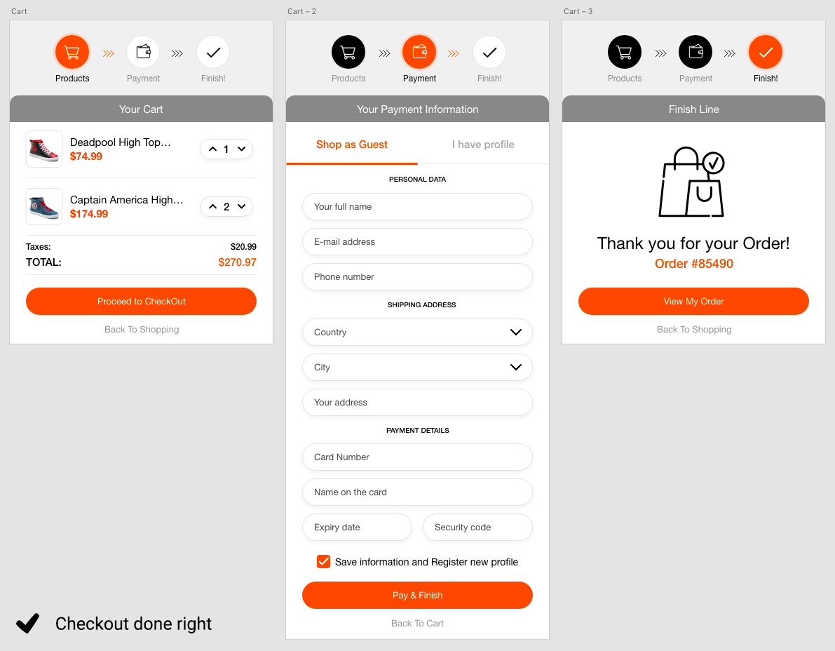
6. Create fast and easy checkout
Probably the most significant element from the E-commerce mobile design is the shopping cart along with the checkout process. If you’ve developed a complex and slow process, the user will opt not to finish their order. According to the Baymard Institute, for instance, 35% of the US online shoppers abandon the checkout because they were required to create an account, whereas 26% are not fond of the long and complicated checkout flow.
Another mistake that brands often make is direct in-cart upselling. Thinking they will entice the customer to spend more, brands forget that the cart’s main function is just to store and sell consumers’ favorited items. For example, forcing your customers to create an account before they have chosen a product or service might actually kill your conversions. Here are a few suggestions for a checkout flow improvement:
- Don’t rush and ask users to register before they’ve made their choices, this will send a signal of additional effort which they’re not ready to make.
- Create a sense of security among your consumers as most people can be quite sensitive about their personal details, particularly bank account information. For example, allow users to save their details for future orders but don’t just do it for them. Reduce their anxiety and reinforce feelings of security by using color psychology in design, requiring a strong password or adding a “lock” icon or trust logos, badges and seals of payment providers.
- Provide different payment options for your customer – Visa, digital wallet or traditional checkout. Try to balance the number of payment options at checkout, so it doesn’t get crowded. You can, for instance, give your customer the chance to shop with a digital wallet by integrating Amazon Pay, Apple Pay or PayPal. This will reduce friction, speed up the process and leave your customers satisfied.
7. Make content as visual as possible
More often than not, users might find it difficult to read on their smartphones. Thus, don’t overwhelm them with unpractical information. Instead, present the customer with captivating visuals like high-resolution images, so that they could be reviewed in detail. Furthermore, the content in the product/service description should be well-organized in short paragraphs and complemented with engaging graphics, charts, pictures. Some of the good practices include:
- Take high-quality product images and invest in good product photography. Don’t forget to take pictures of real people using the product – a way to best demonstrate what can be expected from the item.
- Record videos, exposing the key features of your product or service. 64-85% people are more likely to make a purchase after watching a product video. Video is the future, particularly for E-commerce. Customers love to watch informative videos and to first experience what they are about buy. This is especially true for mobile users, who find videos more accessible compared to text descriptions and images they have to flip through and zoom into.
Conclusion
In E-commerce, prioritize creating a responsive, smooth and user-friendly UX that will increase user engagement. Emphasize on the right visuals, simplify processes, promote speed, security and ease of use. Don’t overwhelm your customers and treat them as individuals with the freedom to choose.
We hope that our tips can guide you towards a better e-commerce mobile design and help you enhance user experience. Nevertheless, have in mind that all the tips you find online, related to optimization, principles and design rules, won’t mean a thing if your product/service design strategy doesn’t have a strong mobile viewpoint. You won’t be able to deliver an exceptional user experience, if you don’t invest in your mobile website. Don’t have an in-house UI/UX talent? Look for outside help by starting small with a Custom UI audit. A quality personalized consultation by a DesignRush’s top E-commerce mobile Design & Development Company can assist you in implementing usability and effectiveness into your user interface.


